Case study — Calendly
Building durable infrastructure inside an organization that won't hold still
A design systems practice built from scratch inside a hyper-growth startup during the remote work revolution — no dedicated PM, high turnover, and a product growing faster than documentation could follow.
A practice from scratch, inside a company that wouldn't hold still
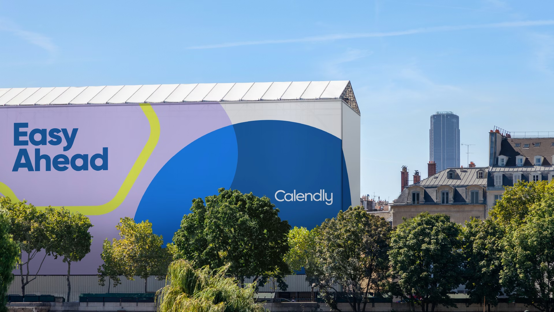
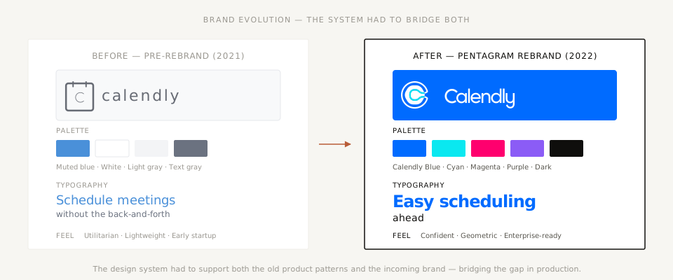
I joined Calendly in June 2021 to establish a design systems practice from scratch and to provide system-level strategy as the company moved from hyper-growth startup into its next stage. When I arrived, Calendly was simultaneously rebranding, launching a new marketing site, and aggressively expanding its enterprise offerings. The company doubled its headcount during my time there. The design org was moving fast, building on patterns that had never been formally consolidated, and it badly needed a shared language.
My job was to build that language — inside a company changing faster than any system could be cleanly documented.
When the plan dissolves in the first quarter
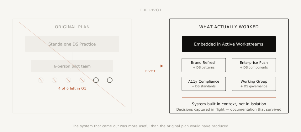
I had built an ambitious roadmap anchored on a six-person pilot team — designers and content strategists who would serve as both subject matter experts and early adopters, helping me rapidly document patterns and establish process across the design org.
Within that first quarter, four of the six left for new opportunities. The remote work revolution was in full swing, and the talent market was wide open in a way none of us had anticipated. The pilot team dissolved before it had a chance to function.
The name of the game became synergy — finding where the system's needs and the product's needs overlapped, and doing the work there.
The pivot was to stop trying to build a standalone design systems practice and start embedding design systems work inside initiatives that were already well-resourced. I found an existing interdisciplinary working group with a project manager already attached and used it as a makeshift design system partner. Design system goals got aligned to project goals. Decisions that would have gone undocumented got captured in flight.
This wasn't the plan. It was more useful than the plan would have been.
What got built under constraint
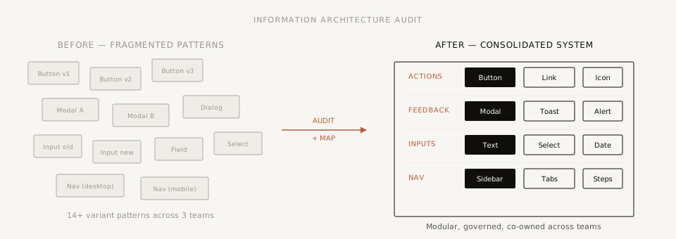
Information architecture audit
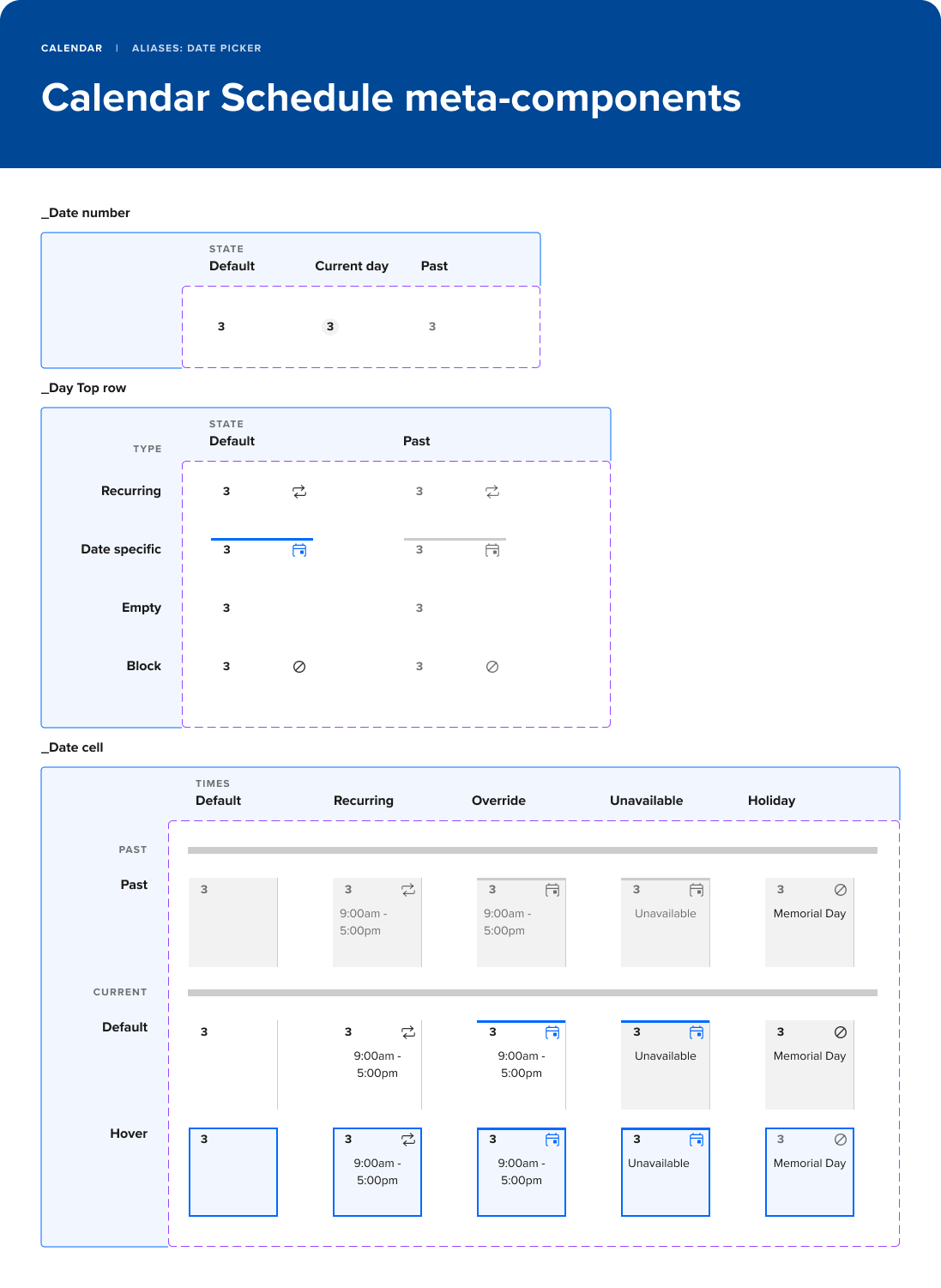
Mapped the existing pattern landscape, identified fragmentation, and established a foundation for component consolidation. Lived in Figma, and became the reference artifact for the design principles work that followed.
Design principles
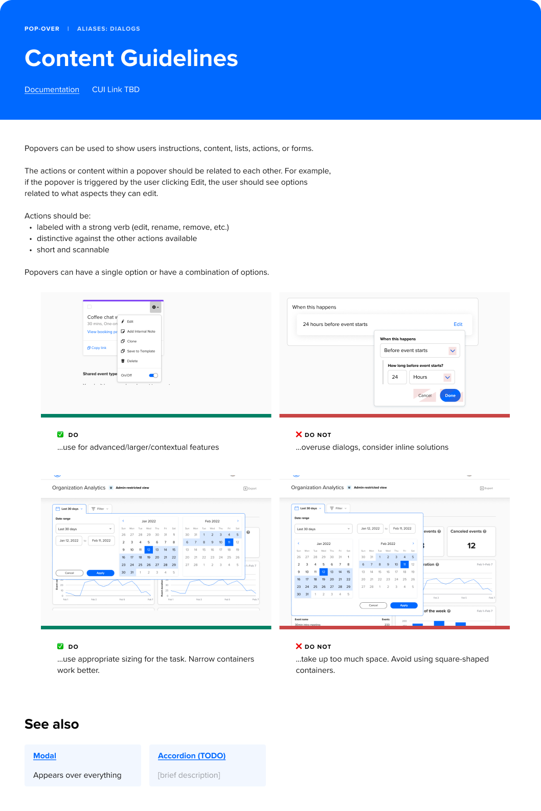
Facilitated sessions with UX designers and content strategists to surface the principles already guiding design decisions — extracted from the team's existing instincts and made explicit. Informed onboarding for new hires into a fast-growing org.
Component library
A modular component architecture built in close partnership with engineering — flexible building blocks designed to adapt across contexts, with contribution and governance models that let the system be co-owned rather than siloed.
WCAG 2.1 AA compliance
Led the design work to bring the product into WCAG 2.1 AA compliance, embedded into the component architecture itself rather than treated as a retrofit — at a time when only 57% of design systems had accessibility guidelines at all (Sparkbox, 2022). Required organizational work too: helping the team understand accessibility as a shared responsibility.
Remote-first working practice
In a company that doubled headcount during a fully remote period, how the design org worked together was itself a design problem. I ran experiments to establish async-first collaborative rituals using Loom, Miro, Figma, and Slack.
High turnover, shifting priorities, no dedicated support, a product growing faster than documentation could follow. A system built under ideal conditions wouldn't have been tested the way this one was. What that looked like in practice: a shared design language that accelerated onboarding as the org doubled in size. Accessibility embedded at the component level, not retrofitted. A modular library that adapted as the product expanded into enterprise. Documentation captured in flight, in context — a living system rather than a static artifact.
Looking back, the collapse of the pilot team was the moment the engagement became honest. Ideal conditions were never coming. Every design system lives inside an organization that is turning over, re-prioritizing, and growing in ways nobody planned for — this one just made that visible early enough to design for it.