Case study — Starchart
Starchart — a practitioner-facing tool for professional astrology
End-to-end product design — service design, data visualization, design systems, and full UX — built solo from scratch and in active daily use with real clients.
Professional astrology practice has a production problem that no existing tool solves well. The tools that handle chart calculation are technically precise but not designed for client-facing output. The tools that look good don't understand astrological data. And the practitioner's reference materials live somewhere else entirely.
I know this because the practitioner in question was me. Before Starchart, producing a single astrocartography report meant: generate chart positions in Astro Gold, recreate them as polished visuals in Figma, switch back to Astro Gold for the map view, cross-reference interpretations against a personal Notion database, navigate to a separate tool for cleaner map rendering, take zoomed screenshots, manually annotate context, and finally assemble everything into a client document.
Every step was a context switch. Every tool solved one thing. Nothing talked to anything else.
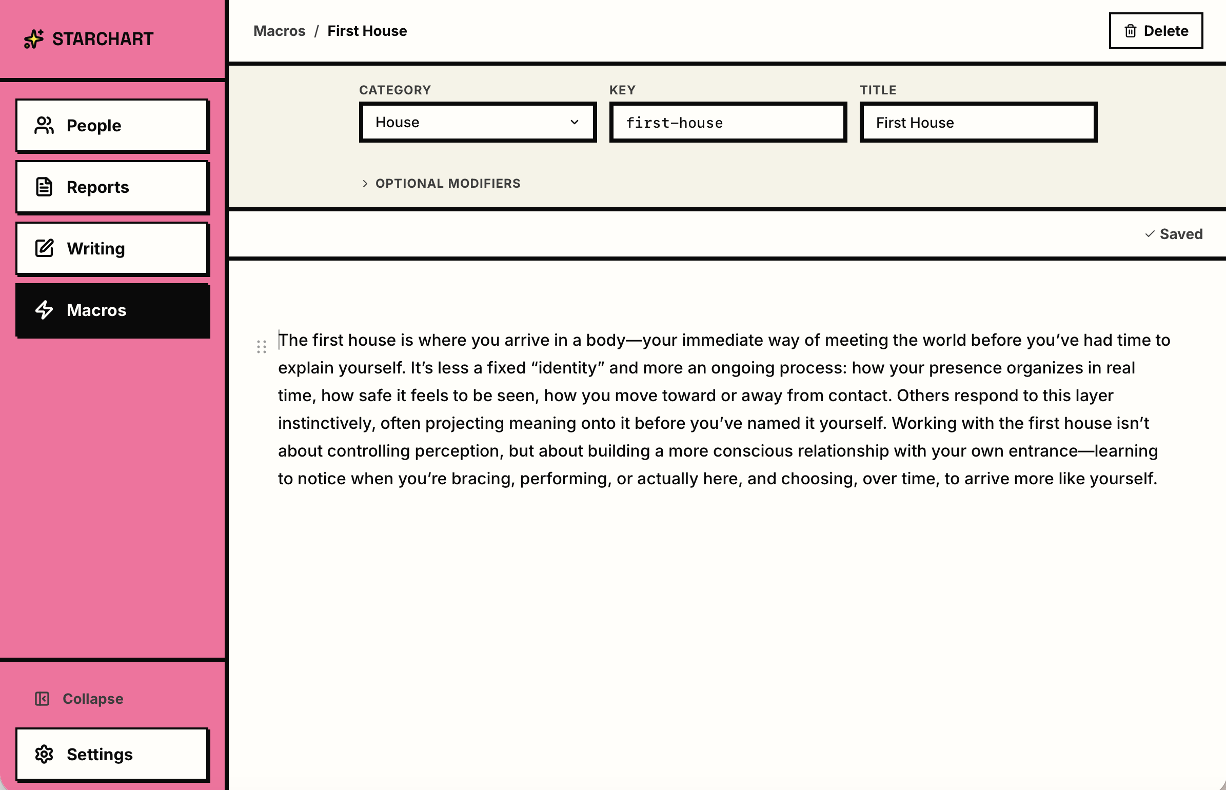
Where the five hours go: writing snippets that replace retyping boilerplate interpretation, embedded astrology components that eliminate copying and pasting from external tools, and client management living side by side with the report surface instead of in another app. The gains aren't from writing faster — they're from never leaving the room where the writing happens.
From Patchwork to Practice
The full product design story
The core challenge was never "how do we make astrology software." It was: how do you design a writing environment where the data, the maps, the reference library, and the practitioner's own voice all coexist in a single space?
Starchart has an unusual actor structure for an internal tool. The practitioner is the primary user, but the client is the downstream recipient of the service artifact — the report. The practitioner's experience is almost entirely backstage; the client never sees the tool, only its output. This two-sided dynamic shaped every design decision: the interface had to serve deep professional work, and the output had to communicate clearly to someone with no astrological training.
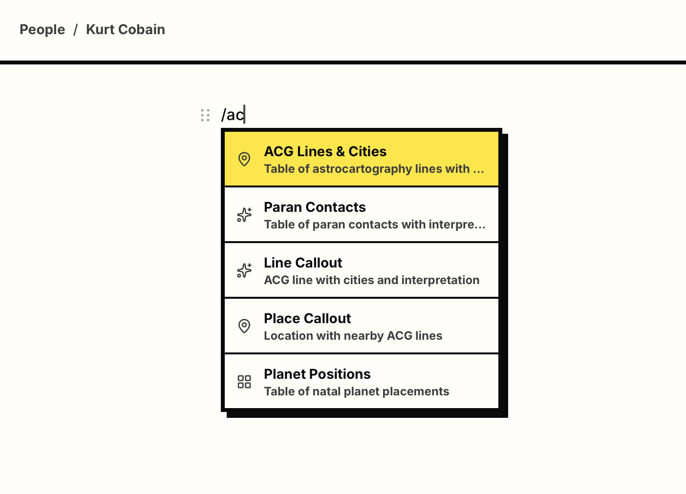
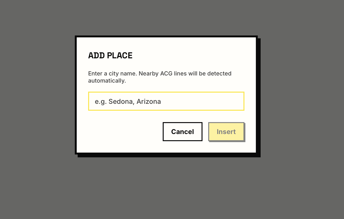
The editor uses a slash-command paradigm to insert structured data blocks — ACG line tables, place callouts, chart positions — directly into the writing flow. Each command opens a focused modal for configuration before inserting into the document, so structure arrives without breaking the prose.
The product produces two report types today: Natal reports, which interpret a person's birth chart, and Relocation reports, which use astrocartography to map where different planetary energies manifest geographically. Synastry and event reports are on the roadmap. The tool is in active daily use with real clients, and a closed beta with additional practitioners is underway by invitation.
One Line at a Time
Visualization in service of voice
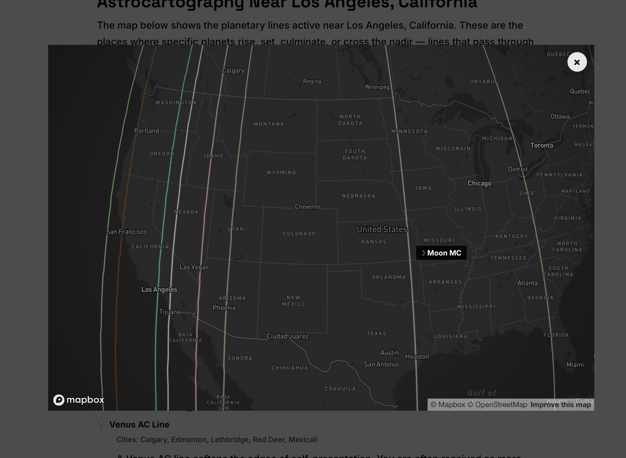
A full astrocartography map shows every planetary line for every planet simultaneously, across the entire globe. It's comprehensive and overwhelming. Starchart's map works differently.
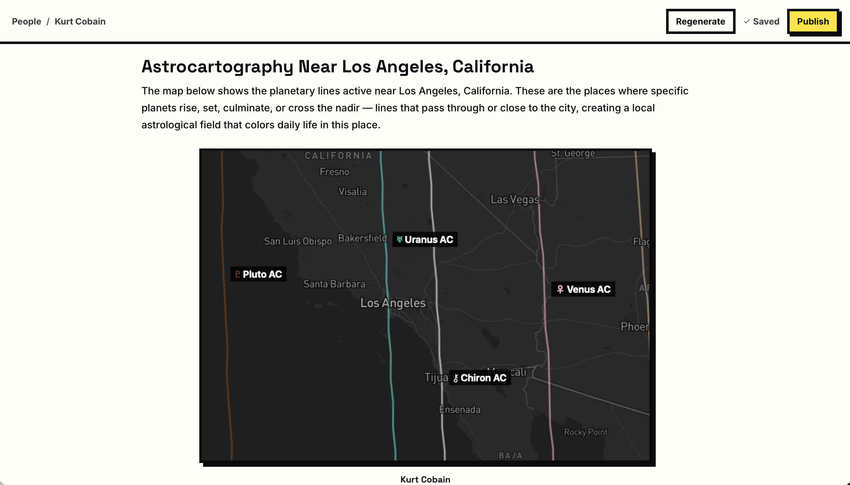
Each map block in a report is a single focused snapshot — one line, one region — configured by the practitioner before the report is written, and captioned in their voice. The map style is a dark Mapbox theme: deep charcoal land, muted borders, subdued city labels. Not for atmosphere — to suppress visual noise. The planetary line is the focus. A single dashed colored line runs through the frame, a labeled chip identifies it directly on the map, and below it a caption in the practitioner's words frames what the reader is looking at. The client doesn't need to navigate, compare, or interpret a legend. They read the paragraph, see the place, see the line, read what it means.
A link beneath each map opens a full interactive version for clients who want to zoom, pan, or explore neighboring lines. Static by default keeps the report fast and readable; interactive on demand respects the client's curiosity without imposing it.
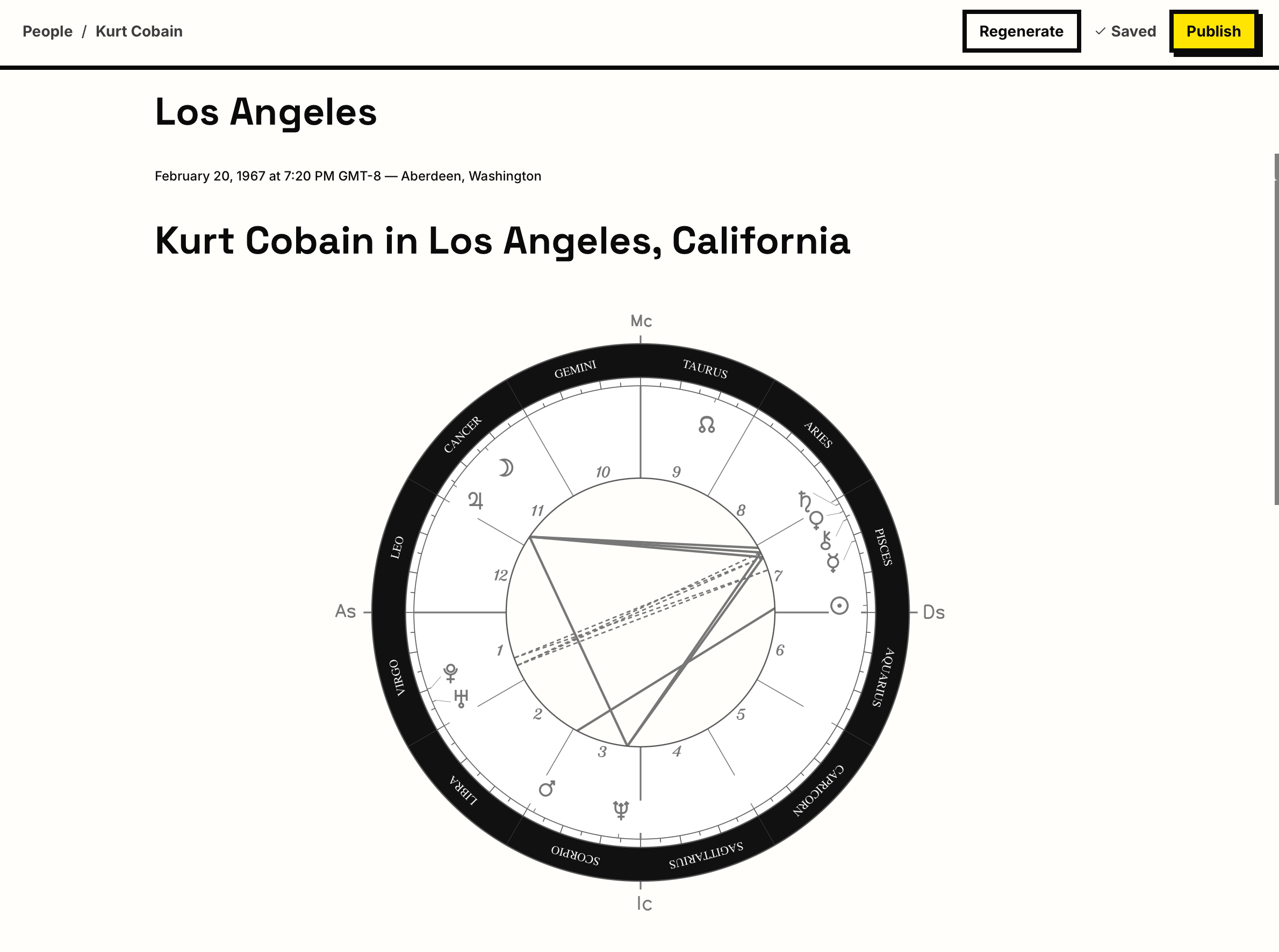
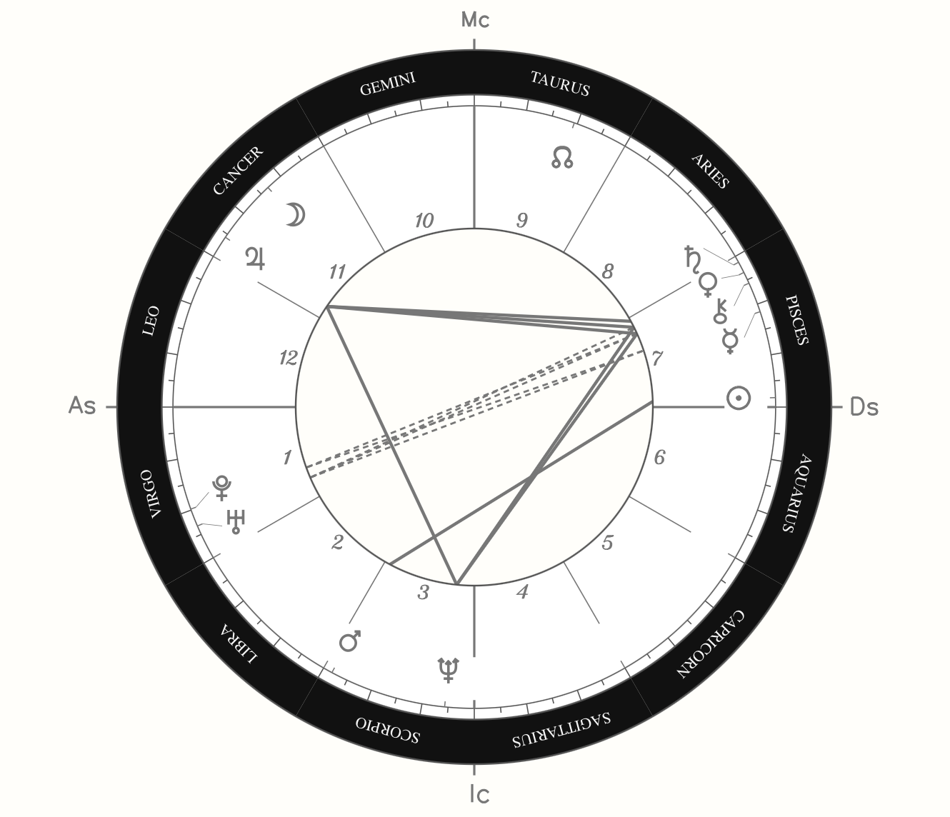
The chart wheel visualizes planetary positions across the twelve zodiac signs and twelve houses at the moment of birth. In the writing context, it functions as an embedded artifact: clean, black-and-white, labeled with the client's name. It orients the reader to the source material without becoming the subject of the document. The chart is context; the prose is content.
The before-state required navigating to a separate tool, zooming to the right area, screenshotting, manually noting context so the screenshot would make sense later, and re-integrating everything into a document. The Configure + Recapture workflow collapses all of that into one decision made inside the writing environment, at the moment the interpretation is being written.
The report the client receives is not a chart dump or a data table. It is written interpretation. Data visualizations serve the writing; the writing doesn't serve the data.
The Two-Sided Backstage
Making the invisible structure visible
Most internal tools have one actor. Starchart has two: the practitioner uses the tool; the client receives the output. Making this two-sided structure explicit through service design methods created a shared reference for evaluating every design decision.
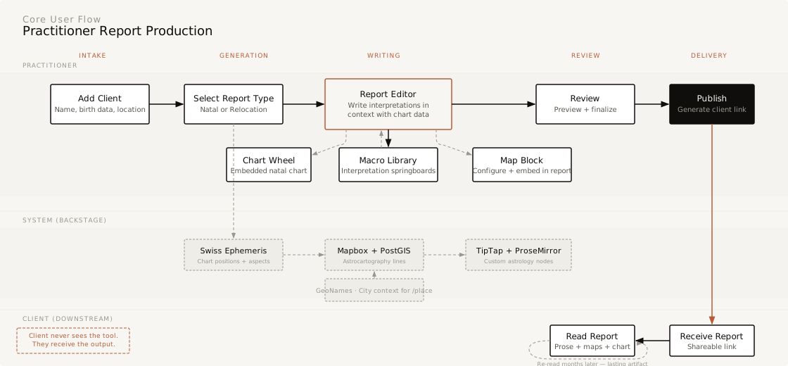
The core flow: the practitioner begins by adding a client with birth data. The system generates chart positions and populates planetary data. The practitioner opens the report editor — a writing environment with chart data and client context alongside the long-form interpretation document, with an interpretation library available for reference. For relocation reports, the editor surfaces a configured map view as an embedded block. Interpretations are written in freeform prose, with structured data blocks — map snapshots, chart wheels, planetary reference chips — woven into the document as the practitioner writes.
The service design work began as a structured way to surface and articulate decisions that had already been made intuitively — and to identify where the practitioner experience and client experience diverged in ways that had design implications.
The service blueprint maps the client journey (minimal: intake, wait, receive, read), the practitioner's frontstage actions (intake, scoping, delivery), the backstage production work (chart generation, map configuration, interpretation writing, report assembly), and the supporting systems. The most revealing finding was the asymmetry.
The client's journey is short and simple; the practitioner's backstage is where all the complexity lives.
Starchart's entire value proposition is backstage optimization — reducing friction in the production process so the practitioner can spend more time on interpretation and voice, which is what clients are actually paying for.
Six experience principles
Geography as organizing logic
The map is primary, not supplemental. Both the tool and the report organize by place.
Voice-forward, data-assisted
Interpretation leads, data supports. The tool feels like a studio, not a form.
Macro as springboard
Saved interpretations are starting points, not scripts. The library lowers the cost of starting.
Invisible backstage
The tool's complexity should not be visible in the output. The report is the only thing the client sees.
Progressive disclosure
Clients receive only what they need to understand the report, with interactive depth available on demand.
Practitioner sovereignty
The tool serves the practitioner's judgment, not the other way around.
What this project taught me
Starchart is a rare case where all four of my practice areas — service design, data visualization, design systems, and UX — appear in one body of work, because the problem genuinely demanded all four. Being the first user kept the work honest: every friction I designed away was friction I had felt.
The deepest lesson is about where value lives. The most careful design in Starchart is invisible to the person it ultimately serves. The client only ever sees a written report in a practitioner's voice — and that is the point. Good backstage design doesn't announce itself; it shows up as time returned to the work that matters.