Case study — Delta at AKQA
Designing at the scale of an airline
Three years across the full digital ecosystem of a Fortune 500 travel brand — responsive web, account experience, a cross-brand design system, and omnichannel infrastructure, told in four chapters.
Delta and AKQA have an unusual agency relationship — not a series of campaigns, but a decade-long digital partnership. AKQA is Delta's agency of record, embedded in product work across every digital surface: the website, the app, in-flight entertainment, wifi portals, chatbots, self-service kiosks, and internal tooling.
I joined that relationship in January 2018 as Senior UX Designer and quickly became the design systems governance lead. Over three years I designed across Delta's full digital ecosystem — from the first responsive homepage, to a white-labeled design system serving multiple travel brands, to a COVID-era omnichannel infrastructure project.
The work spans four chapters. Each stands on its own; together they tell a story about designing at scale, in an ongoing partnership, inside one of the most complex digital environments in the travel industry.
Homepage Redesign
January 2018 — the first responsive phase
Delta's e-commerce site in early 2018 was non-responsive. Mobile booking was exploding, but delta.com couldn't deliver the same experience on a phone or tablet.
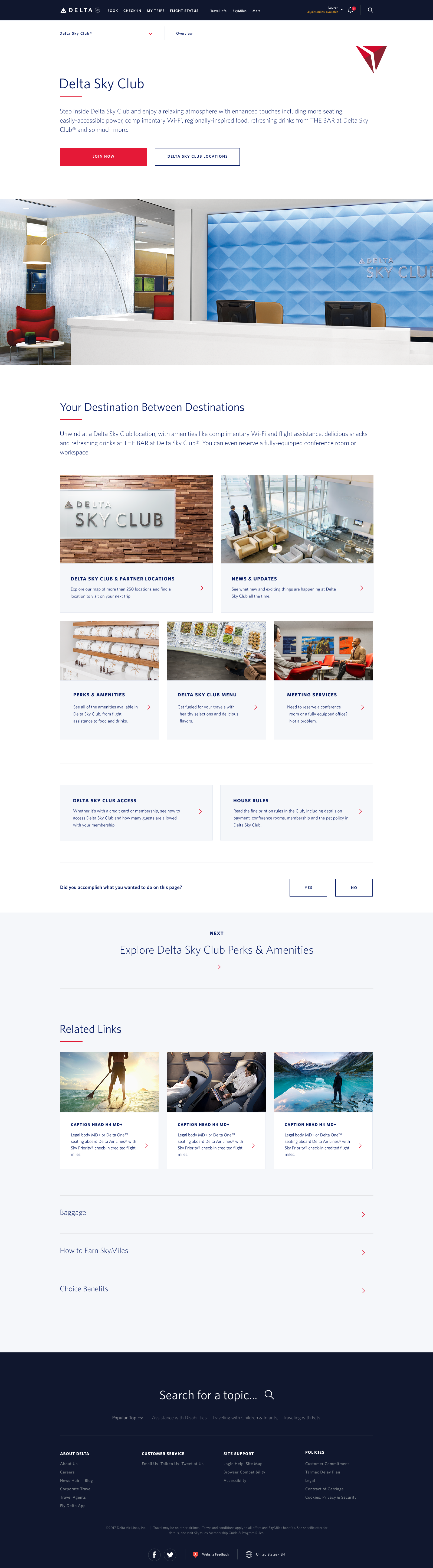
The homepage redesign was the first phase of the responsive transition — and the first public appearance of what would become the Fresh Air Design System. It was also my first project at AKQA; I came in as Senior UX Designer and design systems governance lead from day one.
The brief was both a branding facelift and a major information architecture restructuring: taking a legacy desktop-first site and rebuilding it for every device. I worked alongside visual designers, an art director, and a creative lead, serving as the primary liaison between AKQA and Delta's internal development team, usability team, and front-end engineers.
The architectural decision that mattered most came in the first weeks. Delta had begun partnering with Virgin Atlantic, so from the start Fresh Air components were built with brand theming in mind — Delta blue and Virgin red as parallel expressions of the same underlying structure. That decision, made in 2018, would pay off significantly over the next three years.
Context shaped everything: over 60% of search traffic to delta.com came from The Points Guy, and Delta's customer base — particularly business travelers — is devoted and vocal. Designing for an audience like that hones your intuition in ways pure data can't replicate.

Customer Experience
December 2018 — account, loyalty, and self-service
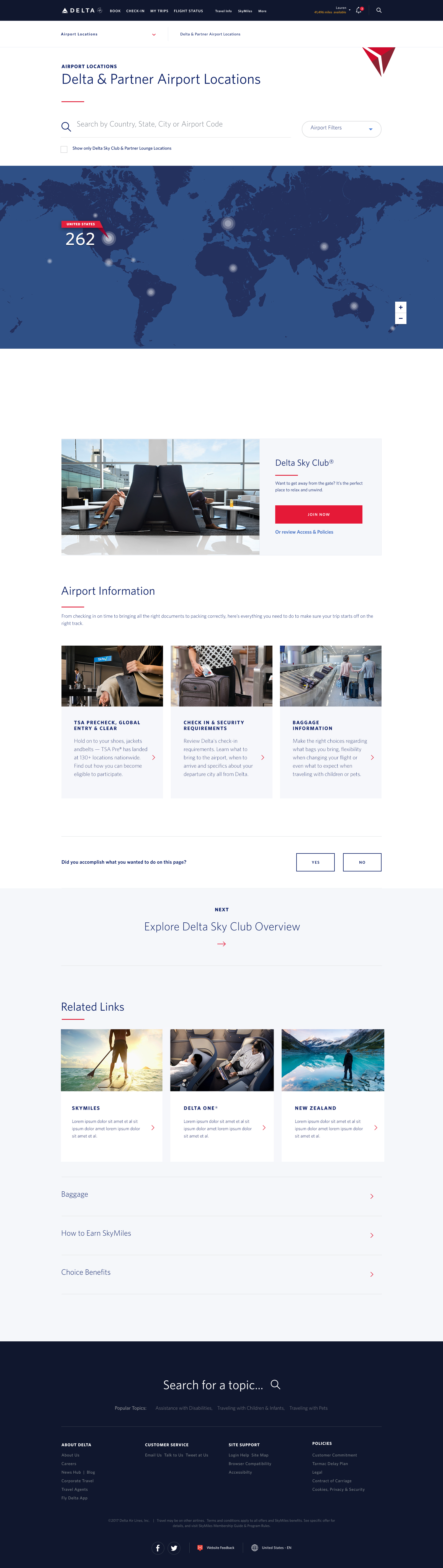
The homepage was the front door. The customer experience work was everything behind it — the logged-in world of SkyMiles accounts, loyalty status, and self-service tools.
Internally called RCX — Responsive Customer Experience — this was where Delta's most engaged customers lived, and where the gap between the legacy desktop experience and the responsive future was felt most. The goals: increase self-service, increase personalization, and build the infrastructure to better anticipate customer needs.
Discovery produced a traveler segmentation spanning six persona types — from occasional family flyers booking through OTAs to corporate Sky Warriors booked by travel desks — mapped across member status, booking context, and loyalty tier. Customer needs were analyzed from both Delta and Virgin Atlantic user perspectives simultaneously, surfacing where the two brands' customers diverged and where they shared underlying service patterns.
Pain points were mapped across five touchpoint categories — Navigation, Account, Booking, My Trips, and Help & Support — and that research grounded the cross-studio collaboration with AKQA London.
Every deliverable was designed in Figma with Delta and Virgin Atlantic themes in parallel — the system being themed in production, with a real partner brand, on the same file. Research and testing ran throughout: I wrote user testing scripts, facilitated usability sessions, and synthesized findings into presentations for Delta's executive stakeholders.
A separate research engagement during this period — the Accessible Travel Services investigation — surfaced the language and system findings that drove a service rebrand and a training redesign. It's its own deep-dive on research method and ethics, told as its own case study.
Fresh Air Design System
2018–2021 — from solo obsession to mature practice
The design system wasn't a separate project — it was the connective tissue running through everything else. But it has its own arc: from a single-person documentation effort in 2018 to a mature, collaboratively owned practice by 2021.
Delta's digital ecosystem in 2018 spanned web, mobile, in-flight entertainment, chatbots, e-commerce, account management, and airport hardware — across multiple brands and legacy systems. Teams were working from fragmented Photoshop and Sketch workflows. Consistency, accessibility, and iteration at scale were genuinely hard.
Within my first few months, I built a static documentation site in Hugo to centralize the design tokens, tone and voice guidelines, Delta brand standards, and functional specs. It became the single source of truth for the system. The transitional period even had a name: Stale Air — the parts of the site still running on the legacy Polaris system while responsive Fresh Air redesigns were built around them.
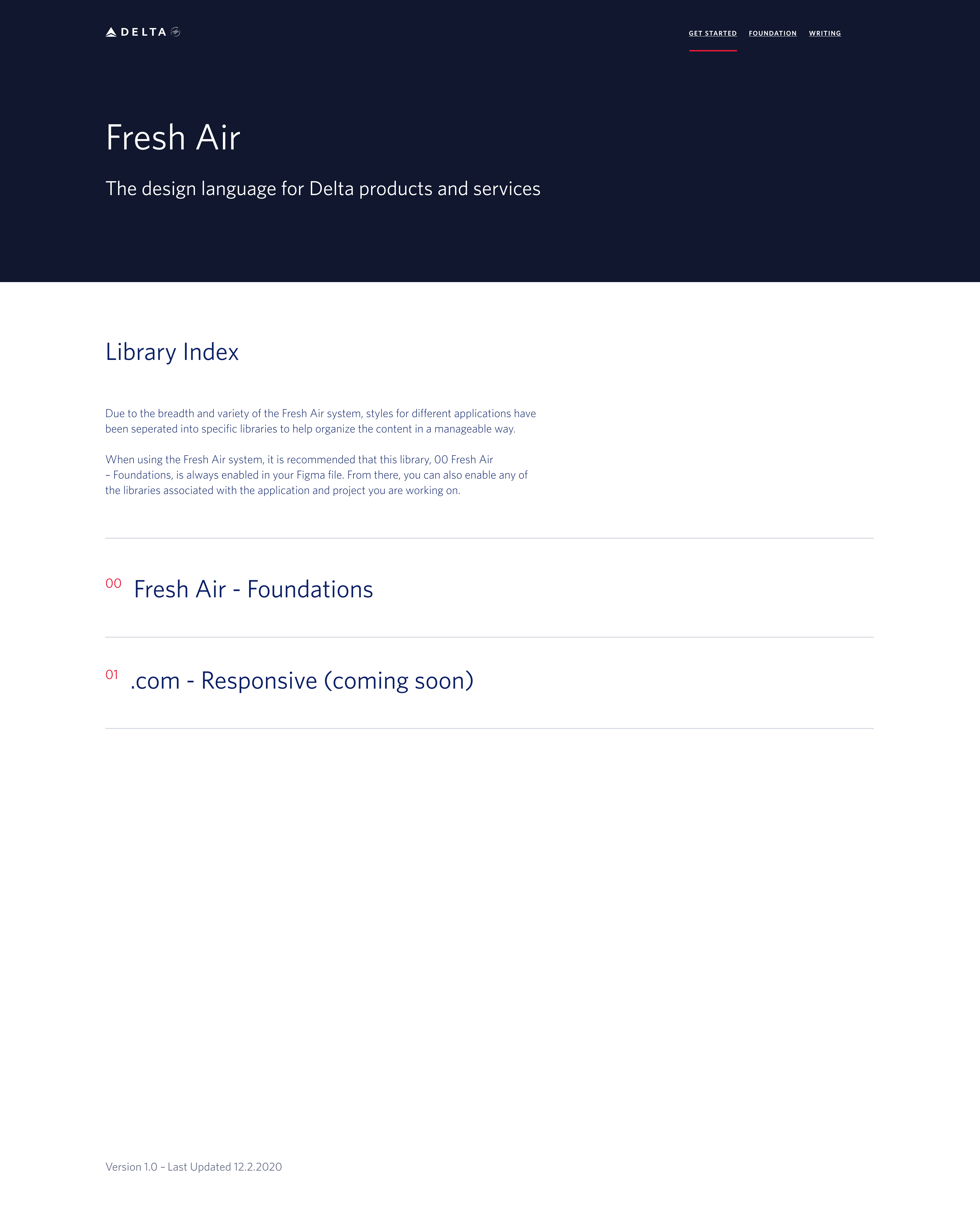
We called the transitional period Stale Air. Design systems with a sense of humor earn higher adoption and co-ownership.
Foundations library
Design tokens, typography, color, and spacing — the theming layer that let Delta and Virgin Atlantic run as parallel expressions of one structure.
Component libraries
Figma components mapped one-to-one to AEM (Adobe Experience Manager) authoring components, keeping design and production honest with each other.
File architecture
A structure designed to create designer quiet zones — protected discovery spaces within a fast-moving production environment.

I led the studio-wide transition from Sketch to Figma. That meant onboarding documentation, training sessions, and a culture shift — from perfectionism toward collaborative iteration. The Figma 101s I ran weren't just tool training; they were the primary mechanism for building shared ownership of the system across disciplines.
WCAG 2.1 AA compliance was embedded into the system's foundations rather than treated as a retrofit, so accessibility scaled automatically as new components were built. Over three years, the documentation infrastructure served global teams, authorship was delegated to Delta's internal partner teams, and governance became distributed rather than centralized.

Kiosk Library
March 2020 — the COVID pivot and the omnichannel gap
In March 2020, COVID-19 hit the travel industry overnight. Delta's priorities shifted hard, projects were paused, and we asked ourselves: what had we always wished we'd had time to build?
AKQA designed for every digital surface Delta touched — including ones most designers never think about: self-service kiosks at the airport, gate information displays, in-flight entertainment systems, wifi portals on the planes. These weren't afterthoughts. They were part of the same digital ecosystem as delta.com and the Fly Delta app, and they needed to speak the same design language.
But kiosk screens moved slowly — updated far less frequently than the website or app — and the assets had never made the migration out of Photoshop. 134 kiosk screens were living in PSDs in a design archive, stranded from the Figma world where everything else now lived.
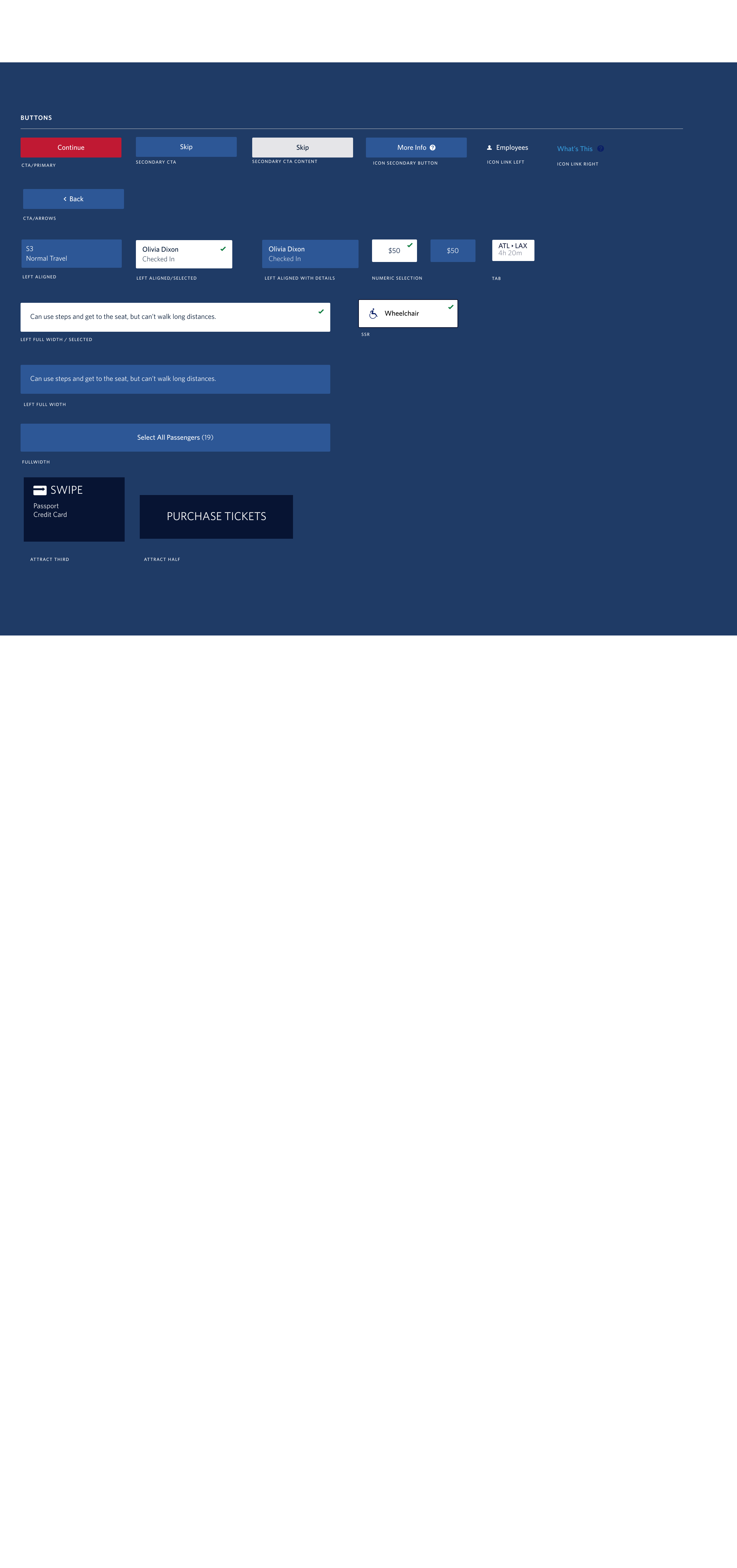
The COVID slowdown was the opening. I dug through the Photoshop archives, rebuilt all 134 screens from scratch using current Fresh Air Figma components, organized them into a structured Figma index, usability tested the library with designers who were new to the team and new to Figma, and recorded how-to walkthrough videos for onboarding.
One person. Bounded time. A clear output: an omnichannel toolkit that closed the gap between the kiosks, the web, the app, and everything in between.
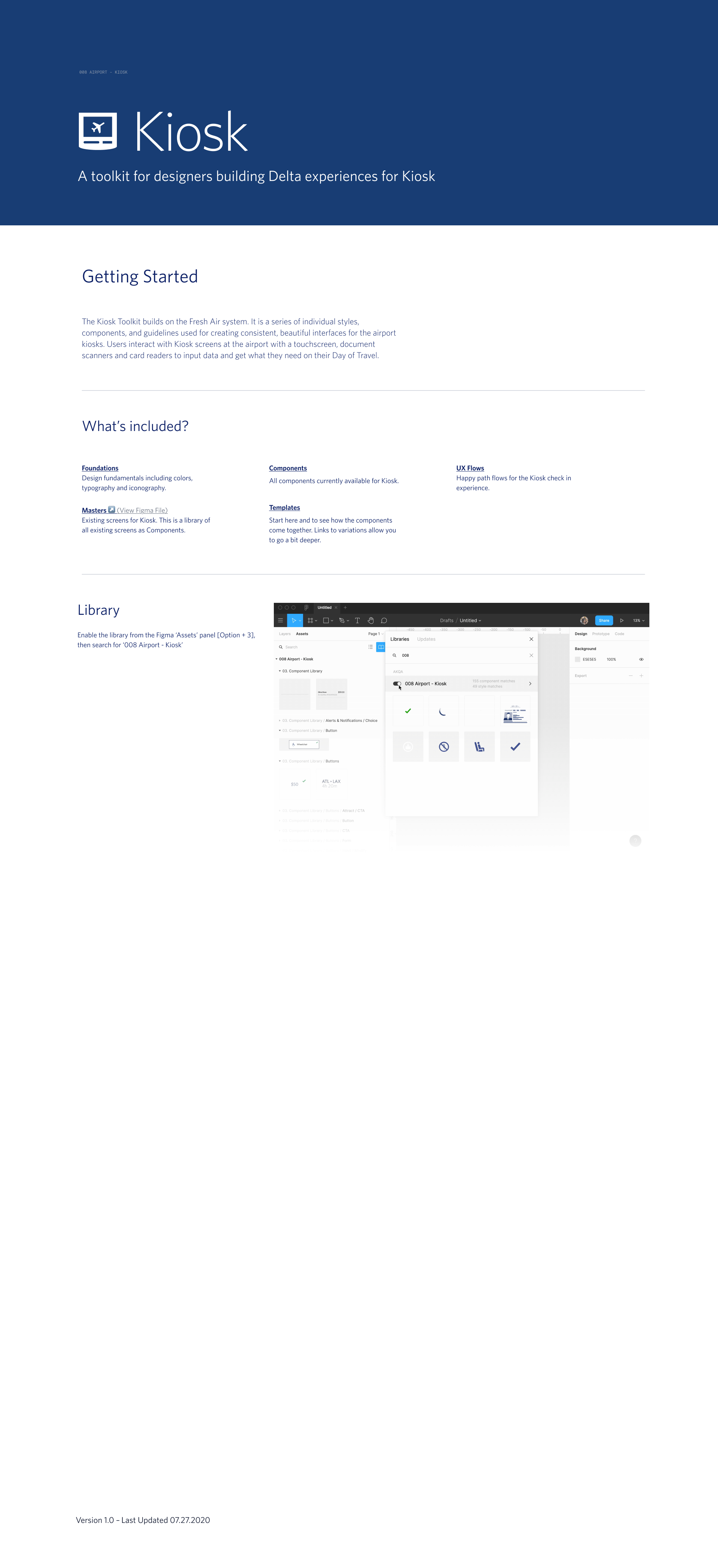
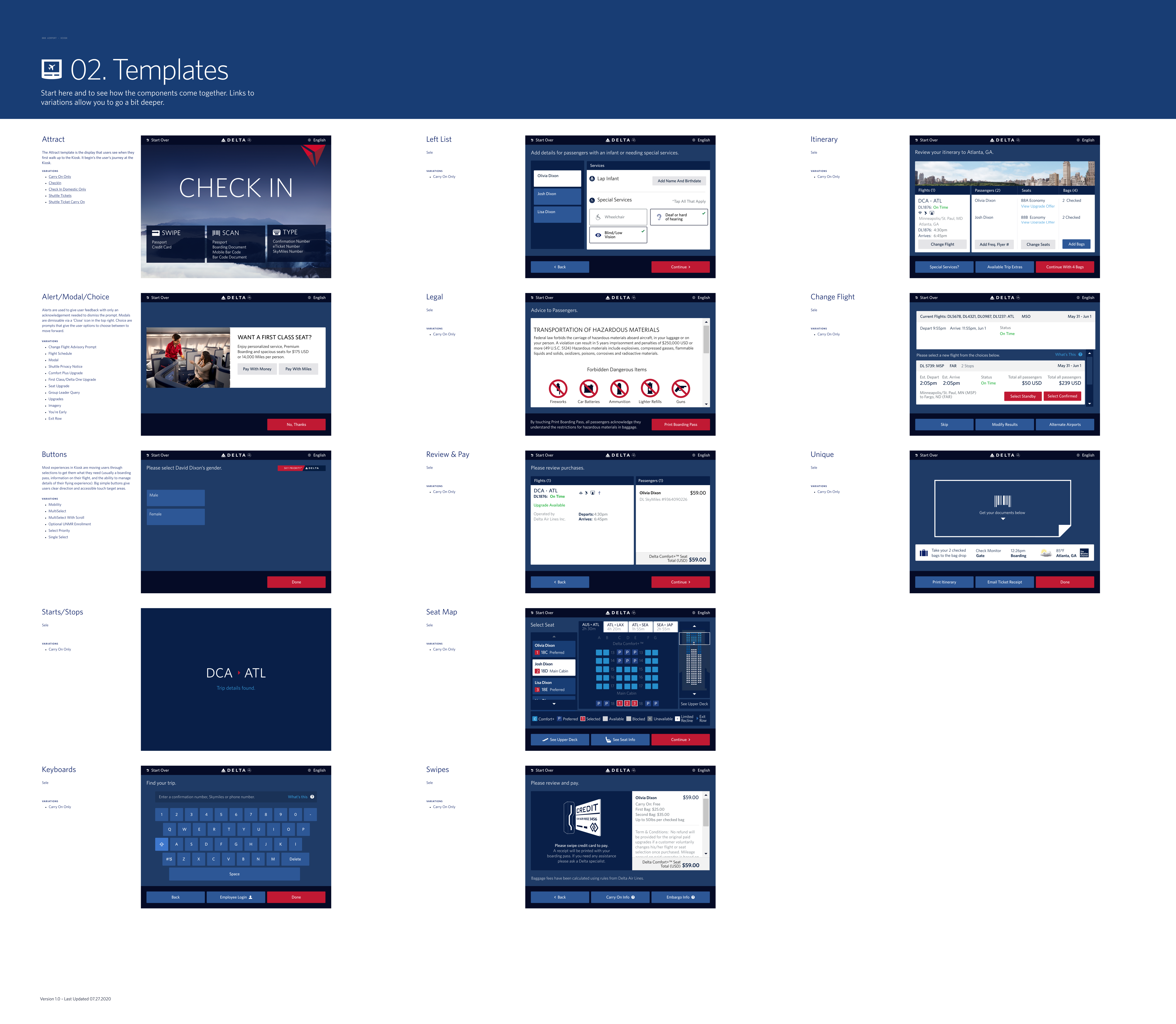
The kiosk library is the most compressed version of everything this engagement was about: systems thinking across surfaces, documentation as a first-class deliverable, and constraint as creative fuel.
Reflection
Three years at one of the world's most complex travel brands, through a major platform transition, a tooling migration, a cross-brand design system, and a pandemic pivot. The Delta work is a consulting story, a design systems story, a research story, and an omnichannel story — four chapters, in sequence, as a single body of work.
What ties them together, for me, is that the quiet infrastructure decisions — theming for a second brand before it was needed, embedding accessibility in the foundations, naming the awkward transitional state so people could laugh at it and own it — did more for the work than any single screen. Fresh Air wasn't just a web and mobile system. It was the design language for everything Delta touched, including the hardware in the airport, and the kiosk library makes that claim legible.